Try everything
In September we launched a total rebrand of Primary, including a new logo, fresh packaging, and a totally redesigned primary.com. I had been a part of rebrands before, but never one that was so closely coordinated across so many teams at the company. It was thrilling.
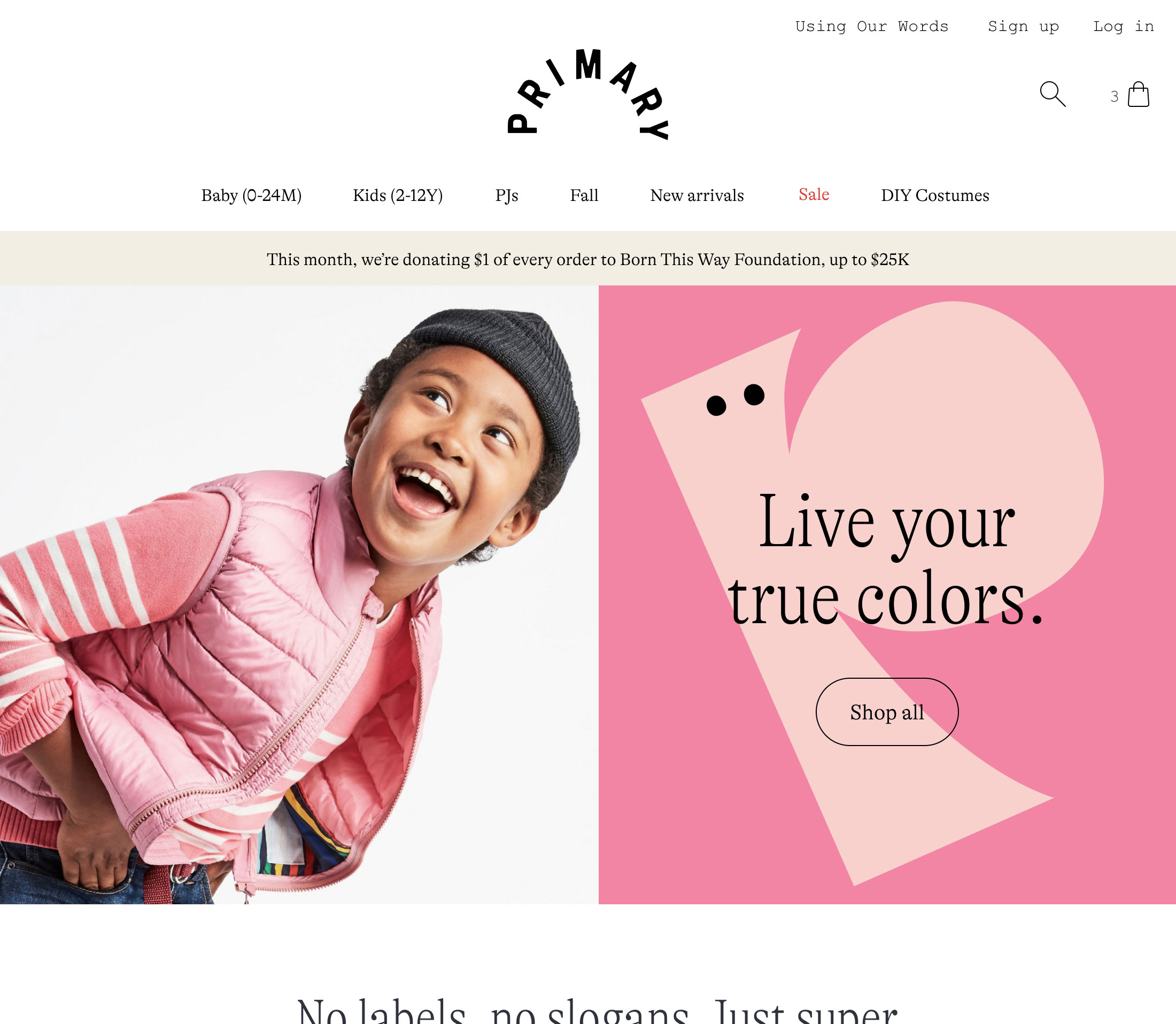
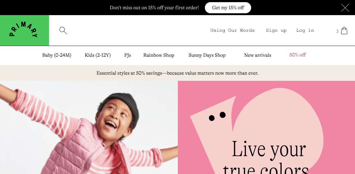
The Primary homepage when the rebrand launched.
A few weeks later, we got some feedback from the leadership team. After sitting with the new site for a little while and having a chance to use it (rather than looking at a static mockup), they realized that something was off about the site navigation. The new logo, which usually appeared against a brand color in our marketing and print materials, was on a white background on the website. And it just didn’t feel right.
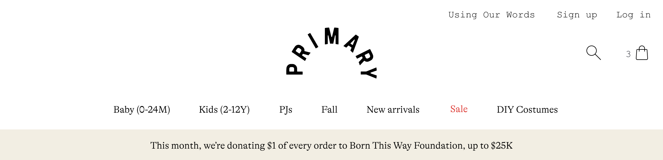
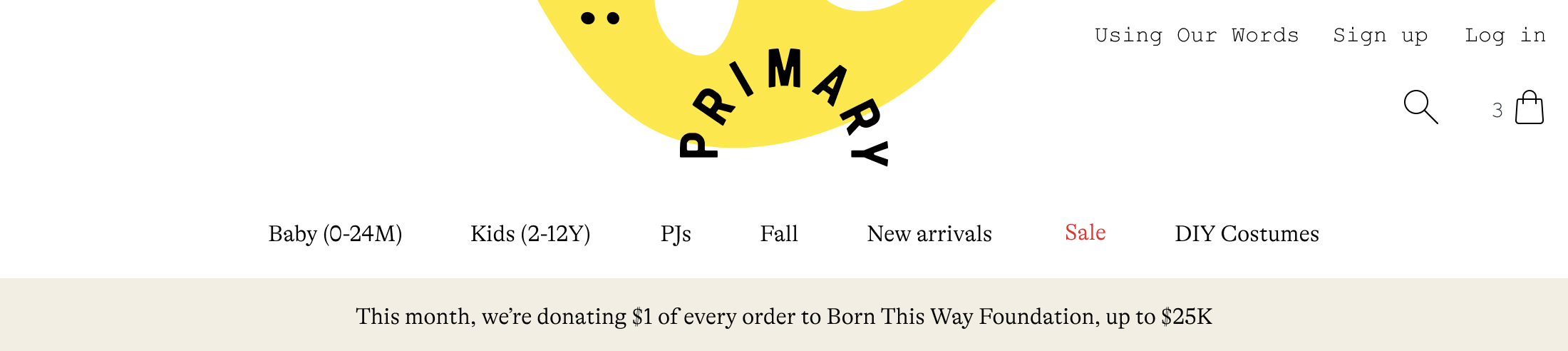
The rebranded site navigation when we launched.
The white background had been a deliberate choice. Our clothes are known for their bold and inclusive colors, and our new branding (developed by Collins) embraced that and gave us a huge palette of 28 colors to work with. When figuring out the best way to incorporate color on the website, I had originally tried bringing it into the navigation, but found that it was incredibly challenging to pick colors for the nav that would work against all of the different banners, photography, and illustrations we wanted throughout the site, each bringing their own sets of colors. In the end, we went with a simple, white navigation that would allow the content on the page to really pop.
We intentionally kept the navigation minimal so the colors on the page, especially in the headers, could pop.
Our leadership team had a really good point, though. If we were going to own color, and be consistent with the way we were treating the logo on other channels, we’d need to find a way for the logo to appear against color in the site navigation. And I had absolutely no idea how I was going to do it.
Like so many other designers, when I first hear a problem, I quickly visualize in my head how I might solve it and what that might look like. When I tried to picture the impact of adding color into the navigation, all I saw was chaos. I ran through a few scenarios in my head (background color? some kind of color blocking?) and they all seemed like terrible ideas. I’m sure my manager, Cap, could see the skepticism all over my face as we talked through how to approach this. Even though I couldn’t think of a solution, I knew that I needed to at least give it a shot. So, I got to work.
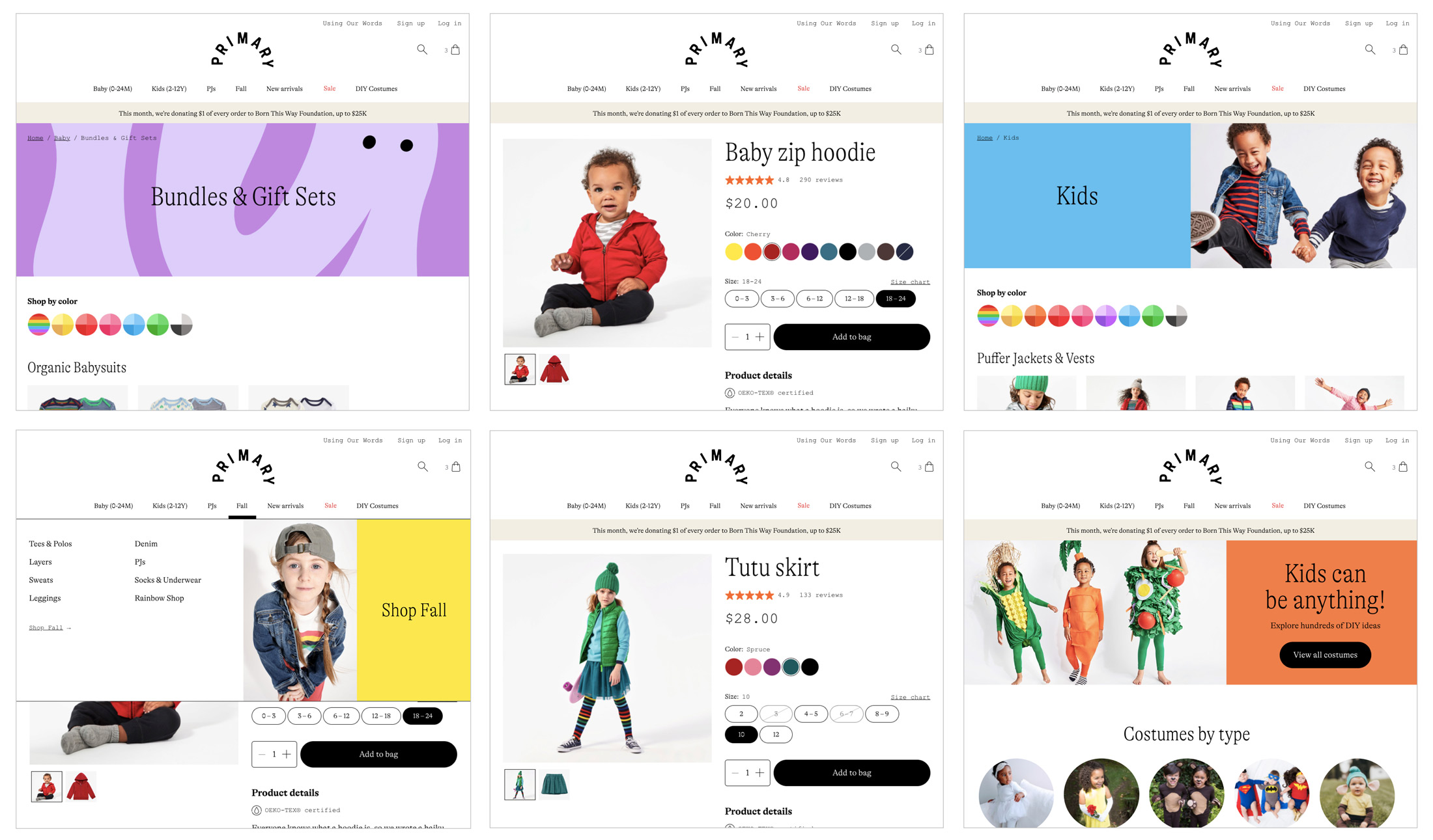
Every day for a week, I tried out dozens of different options for the navigation, shared them for feedback, then tried again. I tried different background colors. I tried color blocking. I tried bold colors, pastel colors, and neutral colors. I tried adding a character, our new illustration elements, for some texture. I tried moving the contents of the nav around and even removing elements. I resurrected old design directions for the navigation from when we were first designing it. I even tried solutions that weren’t explicitly bringing color behind the logo, in the hopes that they might bring more color to the nav indirectly. Then, when I hit a point where I had no ideas left, I would share the Figma link with Cap, post it in our design Slack channel, or bring it to critique. We’d eliminate the directions that were terrible, then star the ones that seemed remotely promising. And then I’d start the process all over again.
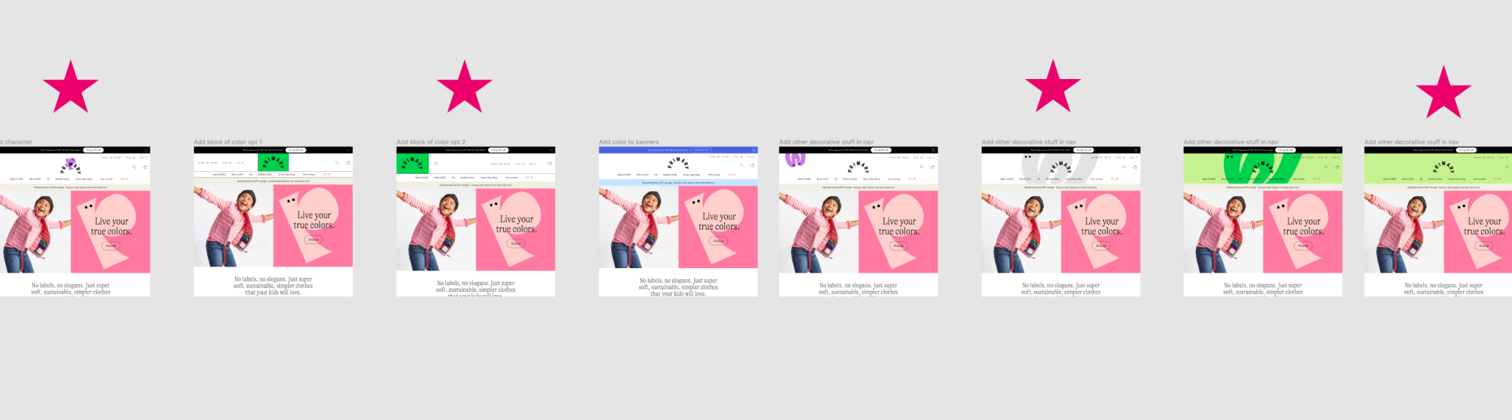
I drew stars in Figma next to the options we decided were worth continuing to iterate on.
I didn’t like anything that I was showing. Some of the directions were truly embarrassing; they’d make you question whether I deserved my job title. But I showed them anyway. I was genuinely stumped and hoped that one of my goofy mockups might spark some feedback that would unlock a new direction. Or, at the very least, if I needed to admit defeat and tell the leadership team that I just didn’t see a way forward, I’d have evidence that I had truly tried everything.
Different attempts at bringing color into the navigation behind the logo.
A week later, I was at the point where I was ready to give up. Nothing was looking promising. In my 1:1 with Cap, we walked through all of the different mockups for the fifth time. “Okay, I have one more idea,” he said. “What if we did something like this version you did with a character, but instead of cropping in tightly, it’s more like, popping in from the top?” I did the thing where I quickly sketch it out in my mind. Not bad. “Okay, I’ll try it out!”
I went back to Figma and placed a character behind the logo, as if it were a little creature hanging from the top of the screen. It was a splash of color, but not too intense. And because it was anchored to the top of the navigation, it never touched the content directly under the nav, eliminating my fear of the colors clashing. After all of that, finally something that worked.
The updated site navigation with a new splash of color.
We sent a screenshot to the leadership team, who loved it. A week later, it was live on the site.
This update to the nav is not the most groundbreaking or clever solution. It almost seems obvious in retrospect. But I truly don’t think I would have arrived here if I hadn’t tried absolutely everything. It took all of those mediocre ideas to find something that struck the right balance between all of the constraints. One idea inspired another idea inspired another idea. Instead of immediately declaring that it wasn’t possible (which I was inclined to do), I gave it a shot and was able to solve the problem.
Trying everything lets you get the bad ideas out, and helps you understand why they’re bad ideas. Understanding what doesn’t work and why can help you get closer to understanding what does. Those bad ideas can also spark new ideas. It reminds me of having to do 100 thumbnail sketches for college design projects; the point isn’t to have 100 ideas, but to go through a process that frees your mind of the bad or obvious stuff so that you can get to the good stuff.
I’m not writing this because I’m perfect at trying everything. If anything, I’m writing this as a reminder to myself of how important it is not to skip steps. (Seriously, someone will probably need to send me this very blog post in the future, and I will be annoyed but then laugh and thank them for it.)
I’ve been thinking about that moment where I quickly visualize the solution to a problem a lot. Sometimes it can really serve me well. I’ve gotten really fast at design execution over the years, and part of that is the speed with which I can cut through possible directions to find something that works. But it can also be to my own detriment. I can mistake the speed of understanding an idea for being able to bypass the actual work it takes to arrive at a good solution. Instead of approaching a problem with curiosity and an open mind, sometimes I’m guilty of quickly drawing conclusions.
Solving problems is a process. Experience can help you solve problems more quickly, but doesn’t replace doing the work. Even when I’m not sure that there is a solution, the least I could do is try.
Posted Dec 07, 2020