One of the most distinct features of Primary clothing is the color palette. Primary clothes come in a range of colors, many of which are not typically available in other kids clothing brands, such as browns, greys, or yellows.
Not only does Primary offer a rainbow of colors, but there are many different shades of each color. Our merchandising team was planning on adding even more colors with the spring 2020 collection, which would bring the total number of unique shades to 54. Every category page on the site, such as “kids leggings” or “baby onesies”, had color filtering at the top, which allowed buyers to filter items by each shade we offered. We were worried that the addition of these new colors in the spring would make the filter UI unwieldy and unusable.
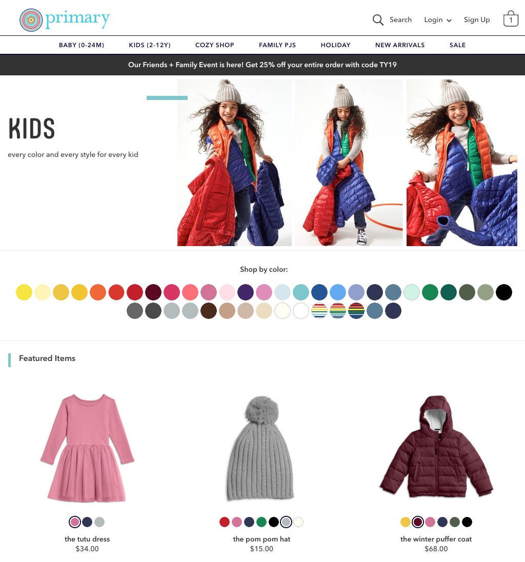
The product list page (PLP) when we started this project. Every shade Primary offers is shown in a row, which on desktop was nearly two full rows of filter options.
A few months before the spring collection was slated to launch, we kicked off a project to revamp the user experience of the filters. Our merchandising team was going to continue to add more and more colors over time with each season, so we needed to make the customer-facing filter UI more scalable without diminishing its presence on the page.
Filters weren’t just becoming a challenge for our customers. Our merchandising team was also struggling with managing all of the different color options in our limited admin tooling. Merch was able to add new colors (called swatches) to the website, but couldn’t define filter rules on their own. Engineering defined the color filter behavior through a very hairy regex. The rules around filtering weren’t always straightforward; the way you’d want a stripe to appear in a color filter is different than how you’d want a polka dot to appear, or a rainbow heart. While we were updating the customer-facing interface, we decided this would be a good time to build more tools for merchandising to give them more control.
Determining the right approach
The tech lead, the CXO, and I began by meeting with the head of merchandising. The merchandising team had an idea that they had been floating around: what if you could filter items by color family (such as “blues”), instead of or in addition to filtering by each individual shade? It was a good idea that raised a bunch of questions for our team. How important was filtering by a specific shade of blue, versus seeing all of the blues at once? How often are people filtering by color? Do people come to Primary with the goal of purchasing a specific color?
We realized that we didn’t know very much about how people were using color filters today, and whether the number of shades available was actually a problem or not. To learn more about how and why people shopped by color, we decided to conduct a round of remote interviews with existing Primary customers. After the interviews, we would show them prototypes of ways we could improve the filtering experience to get directional feedback. As we prepped for research, we also compiled a list of questions for our data analyst to dig into.
The goal of the research wasn’t to get usability feedback or to have really solid prototypes. Instead we wanted a general understanding of how each prototype met (or didn’t meet) customer needs. I created really simple prototypes using Invision to demonstrate four different directions that we could take filters in. I also made sure to include the new spring shades so that we could get feedback on what that experience would be like at launch.
Prototype 1 (left) showed the same UI as the existing experience. Prototype 2 (right) showed a dropdown of color options.
Prototype 3 (left) showed the cluster concept. Prototype 4 (right) showed the color families concept.
- Hypothesis 1: Customers want to see every single shade that Primary offers, and the existing color filter UI allows them to do so in the easiest way possible. It seemed worth testing the existing UI to validate that adding more colors will, in fact, be a less-than-ideal experience.
- Hypothesis 2: Customers want to see every single shade that Primary offers, but they want a simpler way to browse all of the colors. We might learn that customers do prefer to shop by a specific shade, but that our existing color filter UI needs to be updated to accommodate a growing number of shades. I started with a dropdown as a way to take up minimal space while containing an infinite number of color options.
- Hypothesis 3: Customers want to see every single shade that Primary offers, but they want a quicker way to jump to the color they’re interested in. This direction was sort of a hybrid of the existing UI and the color families concept. Imagine clusters of color shades by family that could be expanded on click.
- Hypothesis 4: Customers do not need to see every single shade that Primary offers initially, and would instead prefer to narrow by color families. This was the biggest assumption that needed to be validated. We also didn’t know if it was ever important to narrow by shade, or if people wanted to be able to select multiple shades.
Our interviews with customers were fascinating.
Multiple participants remarked on how many colors there were in Prototype 1 and how similar some of the colors felt. They struggled to tell the difference between some shades.
The majority of participants said that they rarely shopped with a very specific shade in mind (unless they were trying to replace or size up an existing piece), but their kids did have preferences for the colors they wore. Often, their kids went through phases where all they wanted to wear was pinks, or greens, or blues. Filtering by color family would make it much easier for parents to narrow their options, since they wouldn’t have to choose between 8 shades of green to find clothing that worked for their kids. Customers also mentioned that they loved having the option to filter by a specific shade after selecting a family, and that multiselect would allow them to view similar shades simultaneously.
One thing I didn’t anticipate getting feedback about was the color dots themselves. The dropdown prototype consistently disappointed people because they were hoping to see a row of beautiful colors at the top of the page. It was a visual that they closely associated with the Primary brand. We realized that it was really important to continue to emphasize the color dots as an important part of our brand.
Coming out of research, we felt confident that we needed to make a change to our color filter UI, and that the best way to do so was to allow buyers to filter by color families. We kicked engineering off on the project so that they could start on the new data model while I fleshed out the interaction details for the filtering UI.
Designing the color family UI
Since I had already iterated on the color family UI a few times before research, at this point I needed to focus on finalizing the way we wanted the UI to work, revisiting the swatches we were using for representing a color family, and finalizing details like animation.
Although we weren’t conducting a usability test, we got feedback in customer research that helped us feel more confident in the interaction details of the filter. Customers were able to filter by family and by shade easily, and could figure out how to clear the filters. They also quickly comprehended the concept of filtering by family, so we felt that we didn’t need to modify the interface too much.
Here’s how the filter worked:
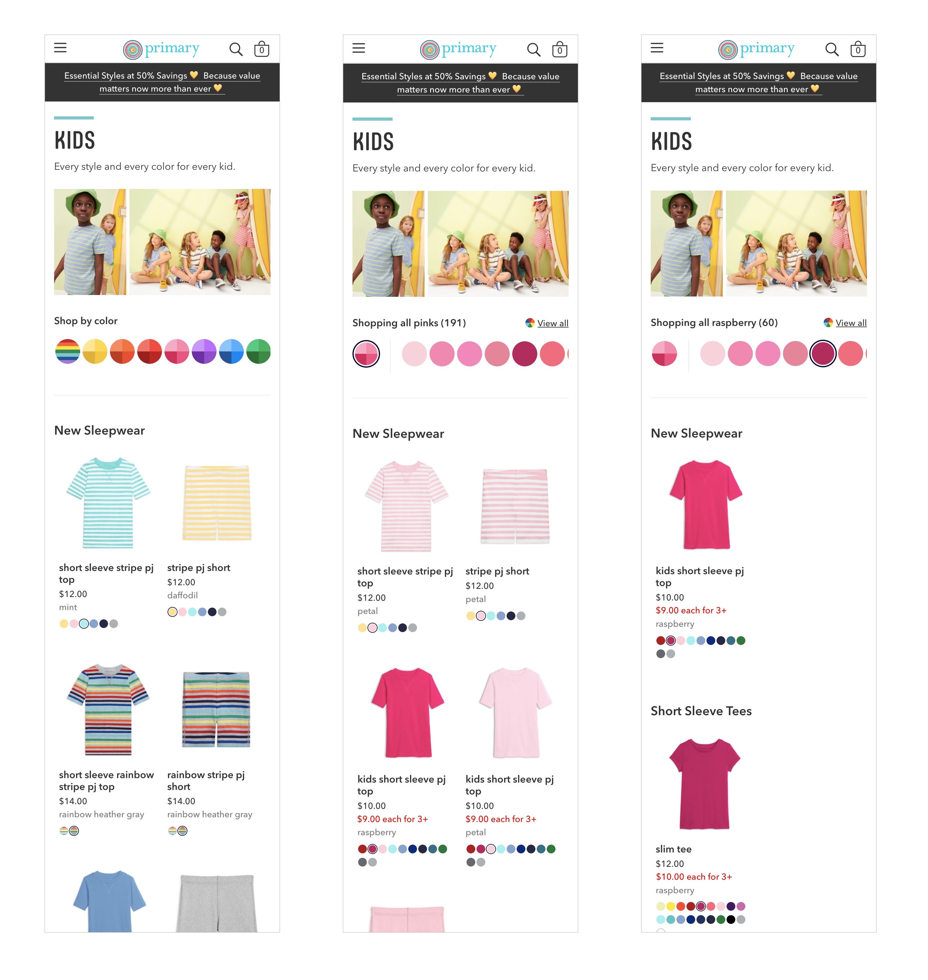
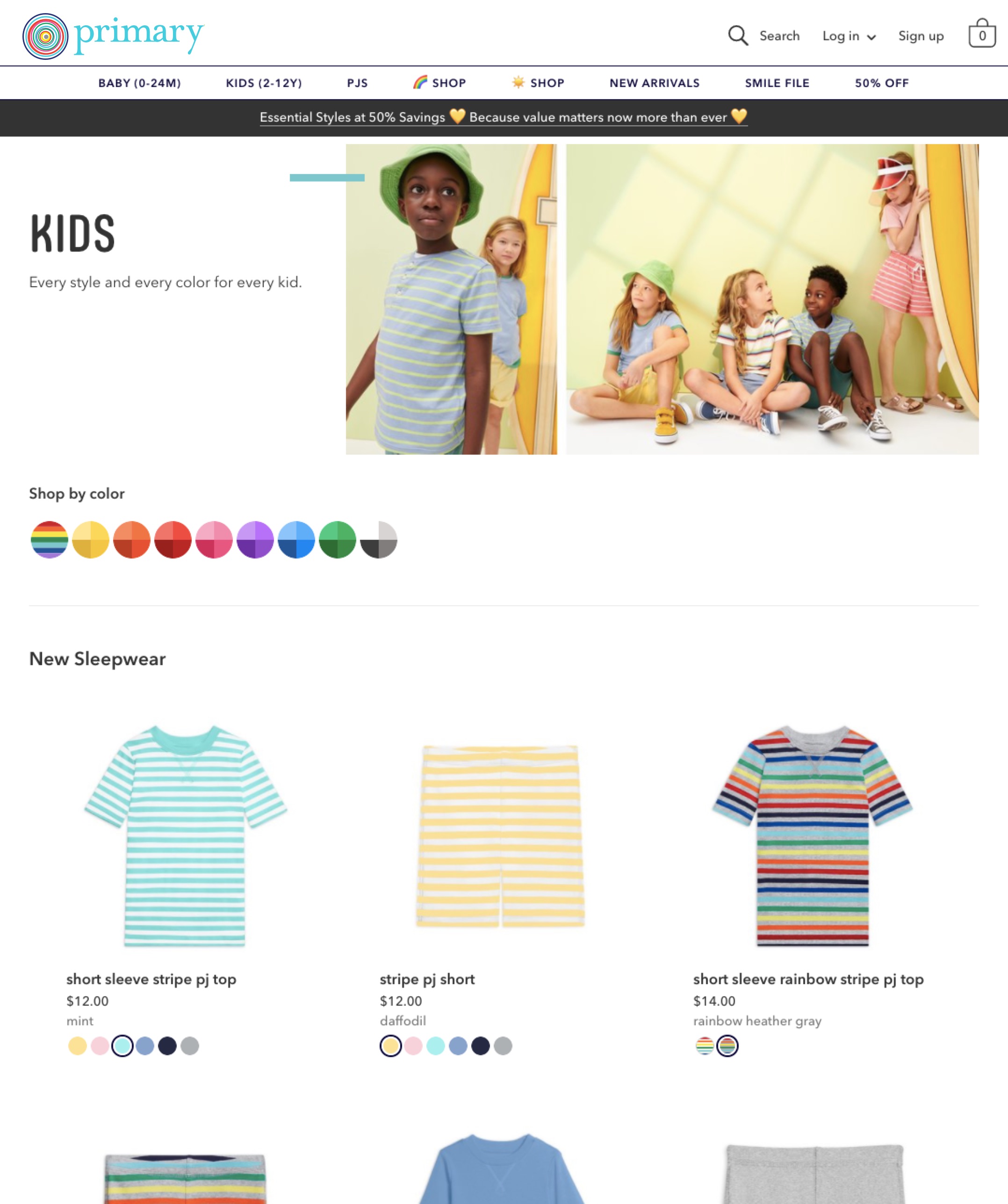
- At the top of every product list page (PLP), we showed a color family swatch representing each color family.
- Clicking on a color family swatch (such as “pinks”) hid all of the other family swatches and revealed the shades that are a part of that family (such as azalea, petal, and raspberry). You would then only see items that came in any shade of pink, and if an item came in multiple pinks (our classic tee comes in both azalea and raspberry), you would see a card for each option that matched the filter. (The “multiple cards” problem was something that did not exist on Primary until this project and had been a huge headache for the merchandising team.)
- From there, you could click on a color swatch to see items that only matched that color, or click on multiple color swatches to see a mix of colors. Clicking on the family swatch again took you back to all of the items in that family, or you could clear all of the filters and return to the default state.
- We also had to define a few rules, such as how the filters would interact with age filters (which appeared on any PLP with items for a mix of ages), and when we’d hide a color swatch or a color family swatch (any time the results would be zero).
I prototyped a transition between the default state and the selected state of the filters, since the content was being replaced in each state.
Since the filter was swapping between two totally different views (the default state with all of the families and the selected state with all of the family colors), and the interfaces were quite different, we’d need some animation to make that transition smoother. I animated a few transitions between states in Principle, then re-built each piece of the animations in CSS in a CodePen to hand off to engineering.
Even though we were focused on filtering, I also wanted to think about the impact the filters would have on the rest of the PLP.
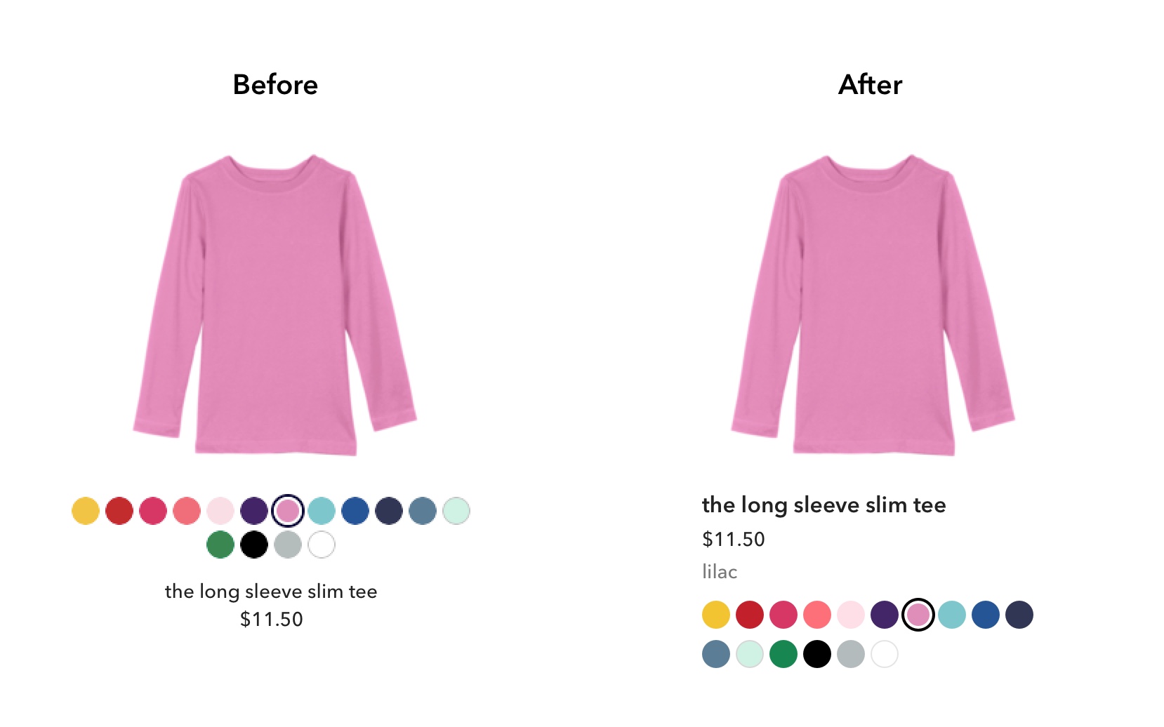
Product cards didn't include the name of the selected color and had centered text (left). We used this opportunity to clean up the information in cards (right).
One thing I realized we weren’t doing in our existing product cards was identifying the name of the selected color for each product. Since we would be displaying multiple cards per product at times, and we got feedback about some colors feeling similar to one another, I added the name of the color into the product cards to make them easily identifiable. I also made a few adjustments to the information display now that we had four different elements in the cards: I left-aligned the text for legibility, bumped up the text size a hair, and moved the swatches to the bottom of the card so that key information was more likely to be in a consistent place.
Finally, I did a sweep of typography across the page and increased everything a bit so the text in between each group of products stood out more.
Designing the color family swatches
With the interaction details defined, engineering started building out the interface while I switched my attention to the color family swatches.
I hadn’t done much exploration around how to represent the family swatch before we went into research, so I wanted to make sure we found the best way to represent a color family that felt on brand.
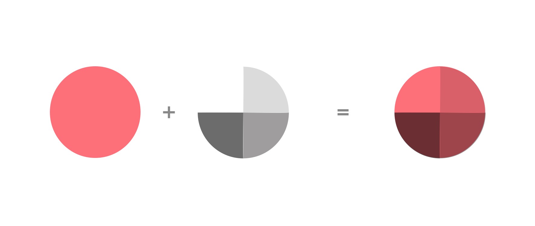
To easily create family swatches, I originally combined our product colors with grey slices set to multiply.
With one element, we needed to communicate that a family swatch wouldn’t just filter by one specific shade, but by many shades. I originally landed on a “sliced circle” mark in which I started with a color from our clothing palette and overlaid grey slices set to different levels of transparency, creating multiple shades of the same color. This read exactly as intended in research, which was great, but something was feeling off about it and we couldn’t figure out what.
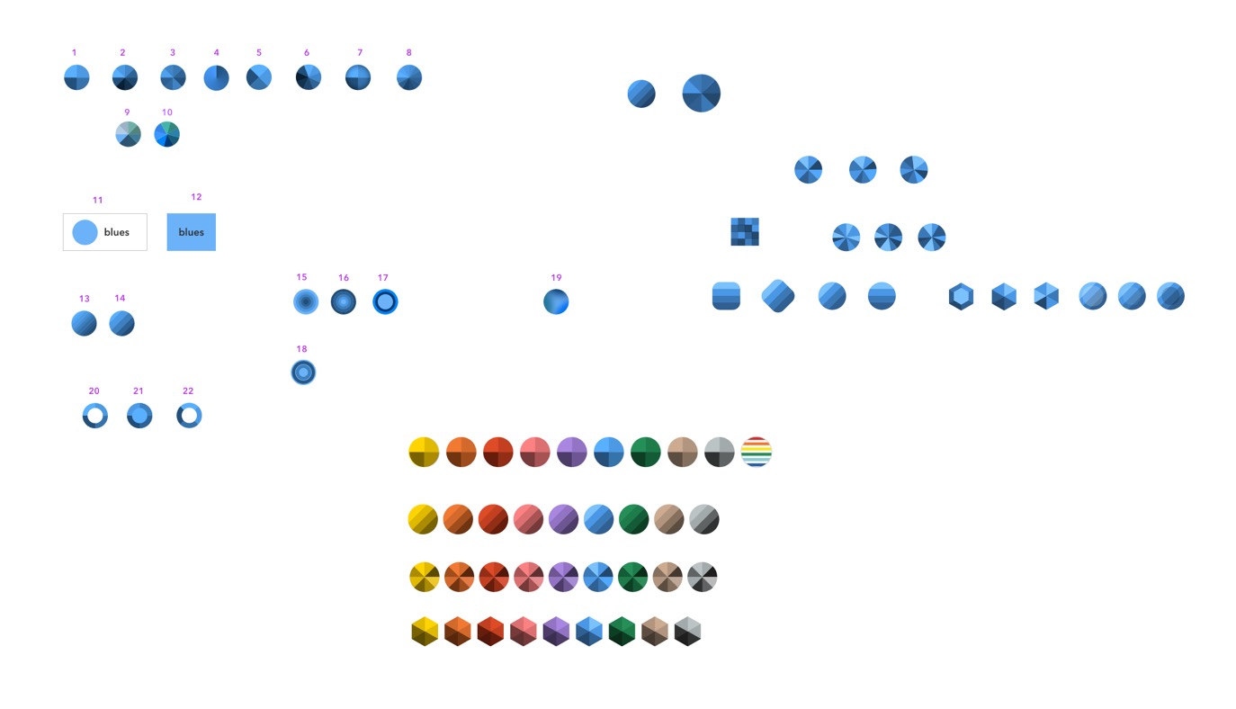
I tried a number of different ways to represent color families.
I spent some time trying different shapes (hexagons, rounded squares, donuts), patterns (stripes, gradients), and approaches to the slices (more slices, unevenly sized slices, non-linear color order). I also tried different approaches to pulling the colors, such as having each slice use Primary clothing colors instead of a color overlay, which only worked for color families in which we offered a wide variety of shades, and fell apart for families in which we only had two or three colors.
After a few rounds of iteration and artboards full of little swatches, we took a step back and agreed on a few things:
- The sliced circle, our original approach, still read as the best way to communicate the concept of a color family. It also didn’t stray too far from how we were representing colors, and maintained the nice row of beautiful colors that our customers associate with the Primary brand.
- Even though I had originally started from Primary colors when generating the different shades for the family swatch, the fact that I was creating darker colors to fill the rest of the swatch meant that there was a huge disconnect between the values of the colors in the swatch and those in the clothing. Our clothing tends to be quite vibrant, and these swatches felt much darker and even drab at times.
- If we wanted fun, vibrant colors, maybe the best way to do so was not through a mathematical approach, but to actually just eyeball it.
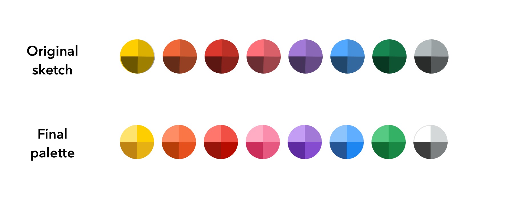
My first pass at color family swatches on top, in which I used greys set to multiply, compared with the final palette, in which I eyeballed the values.
I took another pass at the original color family swatch design. This time, I lightened each color, and then began to stray from the values to inject some vibrancy into each slice. I warmed the greys, made the dark yellows feel less brown, and chose a richer purple. The colors we ended up with for the family swatches look much more at home next to our clothing than where we started.
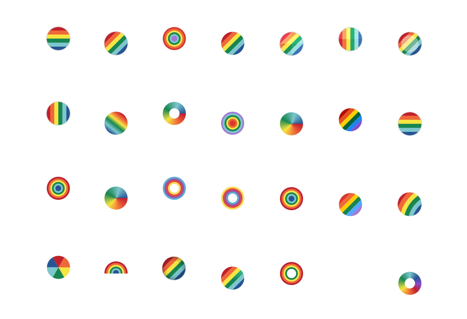
A round of explorations on how we might have a rainbow family swatch.
Something that didn’t fit nicely into our color family system was rainbow. Primary is known for offering many styles in rainbow; we have rainbow stripes, rainbow dots, and rainbow hearts, and we even have different shades of rainbow (classic and sunwashed rainbow). We needed to have a top-level color family filter for filtering by rainbows, and the sliced circle graphic wasn’t going to work. Figuring out how to visually represent rainbow in such a way where it didn’t read like “filter by stripes” or “filter by all colors” or “filter by multicolored” was also a challenge. I tried a number of different graphical representations, and we landed on a circle with a rainbow stripe.
Now that we had refined the interface and interactions for filtering, we decided to run a round of usability testing with a mix of existing and new Primary customers to get feedback on the interactions. We also wanted to ask specifically about what people thought about the rainbow swatch before interacting with it. As expected, comprehension about the rainbow swatch was mixed before people clicked on the swatch, especially for new Primary customers. But once people clicked on the swatch, they felt like it made sense. Since rainbow is such a unique thing to Primary, we decided we were comfortable with moving forward, especially since we were adding a label to each family and swatch on hover (on desktop) to display the name.
The final filter design
The final filter design on mobile. Left to right: the default state with all of the color families, color family selected state, and shade selected state.
The final filter design on desktop.
Tooling for merchandising
The last piece of the puzzle was building tooling for our merchandising team so that they could manage how color filtering worked. Up until this point, engineering had to be involved every time merch added new colors or needed to define or change filtering behavior. Our goal was to get out of the way and let them have full control through tooling.
As the filtering project progressed, we had been meeting with our merch team to get feedback on the customer-facing UI and to understand what tooling they’d need.
Merch needed to be able to do things like:
- Add new colors and new color families
- Define the family for each color
- Define the ordering for color families and for each color within a family
- Identify the filtering rules for complex colors like patterns or multi-colored items
The existing admin tooling for managing colors.
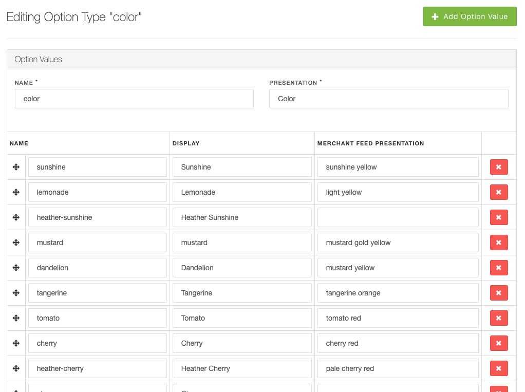
There was an existing tool for managing colors in our admin tooling, but it wasn’t very user-friendly; the copy was unclear and didn’t match the language the merch team used, and there weren’t visual representations of colors anywhere, so it made sorting the colors very difficult. There were no subpages; the table of colors had every form field exposed. If we were going to add more information to each color (the color family, filtering rules) then we’d need to rethink the architecture of color management a bit.
Before jumping into wireframes, I whiteboarded with the engineer responsible for the data architecture to make sure that I understood the data model and how complex colors like stripes and rainbows would work. From there, I did four rounds of wireframes as I explored the simplest way to manipulate a system that was surprisingly complex, and got a ton of feedback from our engineering and merchandising teams along the way.
Our merchandising team wanted the color system to have a ton of flexibility. For example, we needed to define the global order of all swatches, which would determine the order of swatches in places like the homepage (where we showcased our vast color selection), the product cards on the PLP (tiny thumbnails to indicate which colors each item was available in), and the product detail page (where buyers could select which color they wanted to purchase). That global order needed to accommodate every possible color our items came in, including patterns. Meanwhile, we also needed an order for color families and each swatch within the family, which would show in the filter UI. It wasn’t necessarily going to be the same order that we were showing elsewhere on the site, since swatches could be a part of multiple families (mint was both blue and green) and we were excluding patterns so that our filters only showed solid colors. We decided to separate the management of the colors themselves from the management of families.
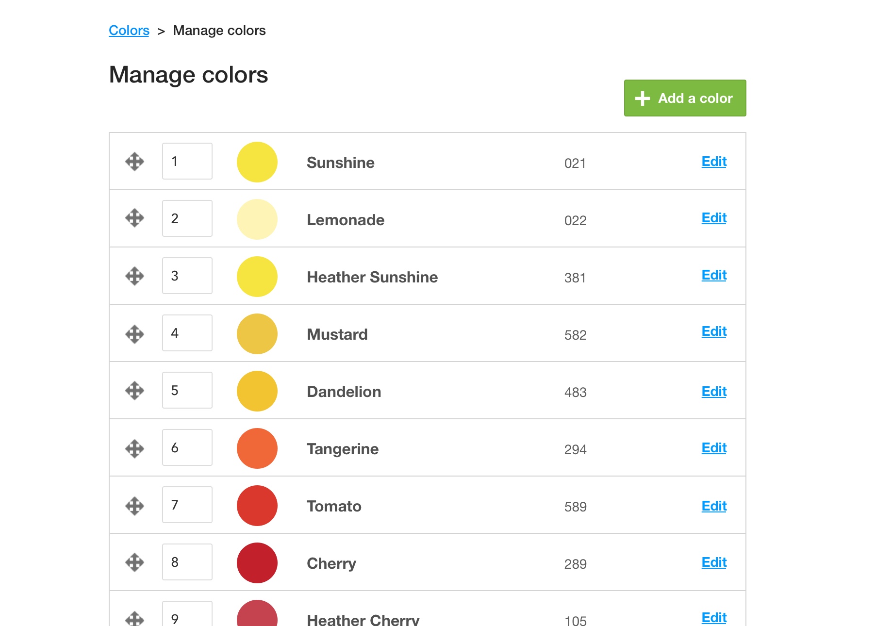
The refreshed global list of colors, with links to edit each color.
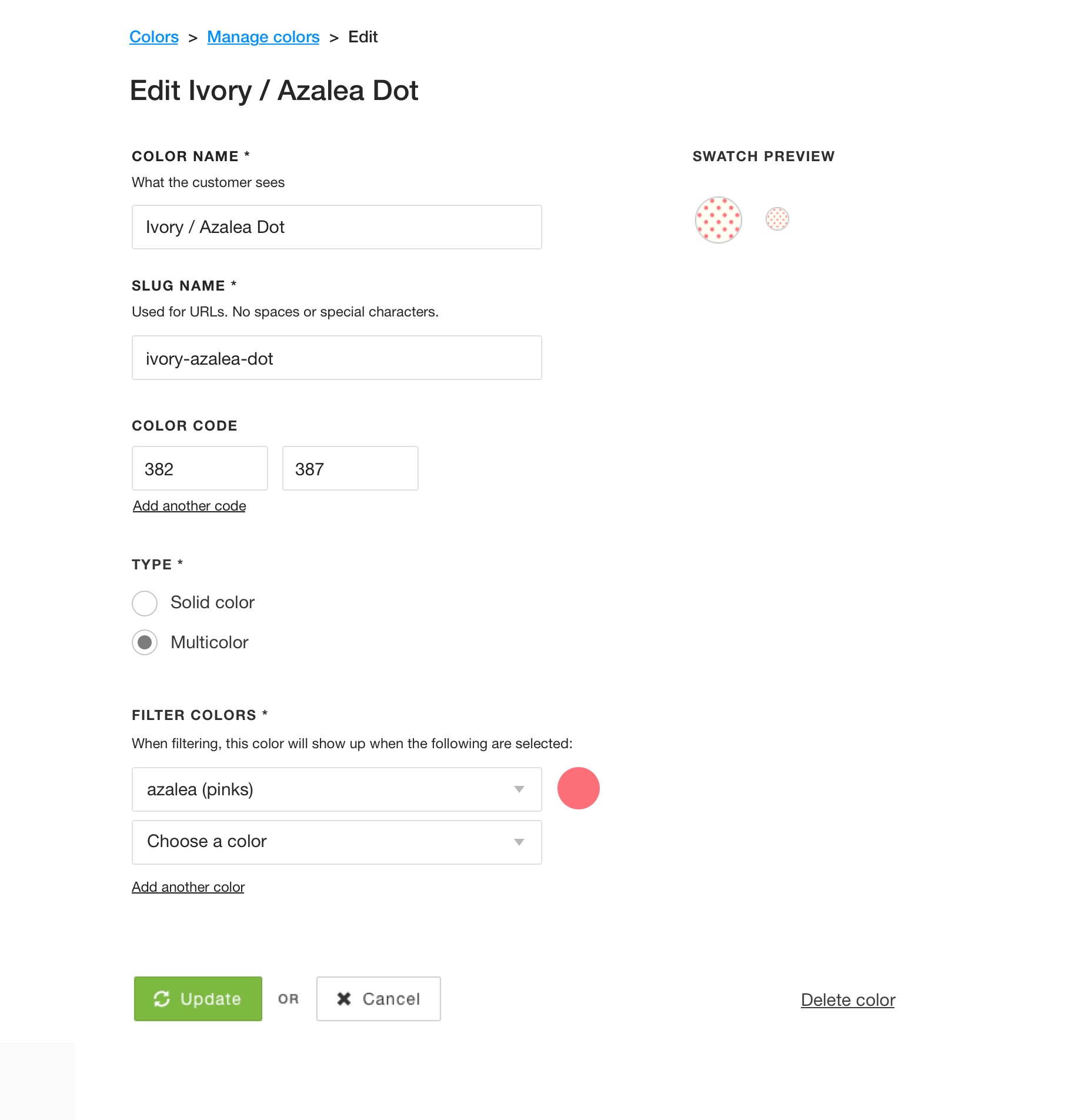
Editing colors happened on a page now, instead of in the global color table.
Color management was about maintaining the global ordering and editing all of the information associated with each swatch. We moved all of the form fields for each swatch to a detail page, and added new fields for assigning color families, indicating whether the swatch was multicolored, and, if so, defining which colors it should be filterable by. For example, a solid cherry swatch was going to be filterable only by cherry, but an ivory/cherry stripe would need to be filterable by both ivory and cherry. Merch could essentially tag a swatch with as many colors as necessary to define the filter behavior.
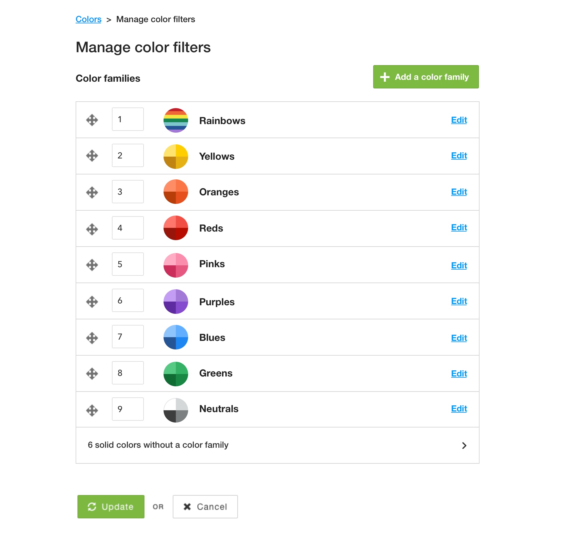
The new tool for managing color families.
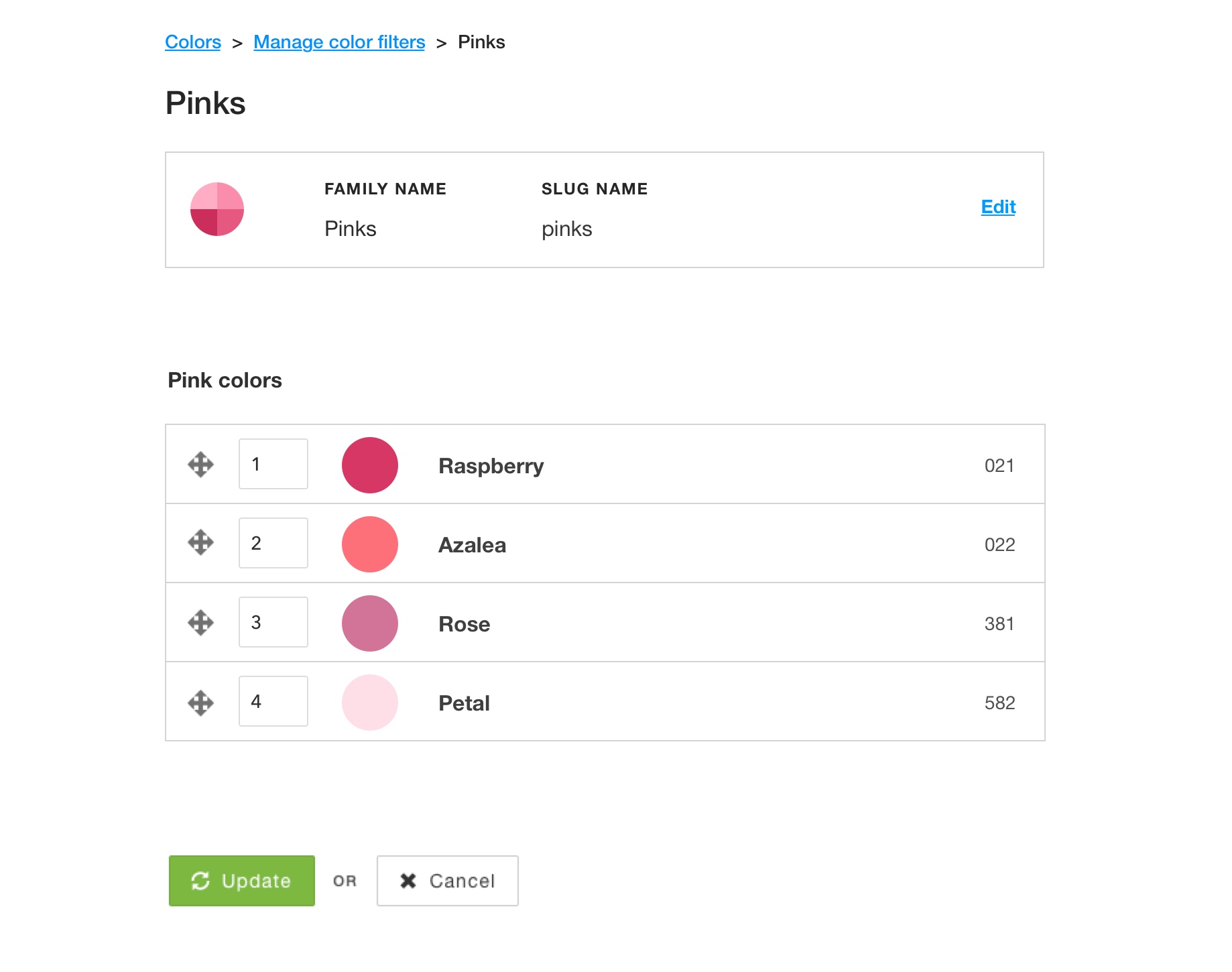
The screen for managing an individual color family.
Finally, we built new tools for managing families. Managing a color family was focused around managing the appearance of the family filters. Merch could reorder the color family filters, create new color families, and organize all of the colors that were a part of the family.
Gaining confidence and launch
Since the launch of new spring colors was imminent, and an experiment would take a few weeks to produce significant data, we weighed our options for how to release the new filter features. We decided the best option was to forgo an experiment and to ramp to all users over the course of a day or two, a week ahead of the spring launch. This would give our merch team enough time to adjust to the new workflow and to fully prepare the site for the spring launch.
While not the main goal of the project, we did some post-launch analysis and estimated that we were able to hold many of our key numbers steady with this update.
Overall, our merchandising team was really happy with this update, and our marketing team has even found ways to use the color family landing pages and family swatch design in email marketing and social media marketing.
Project details
Role
Design, front-end development
Core team
1 project manager, 1 tech lead, 3 engineers, plus a contract researcher and a contract data analyst
Released
January 2020