When buying products online, you’ve probably encountered links to products which showed swatches of each color or pattern an item comes in. These swatches can be really useful when deciding whether to click on a product on a category page, or for selecting the right option on a product detail page.
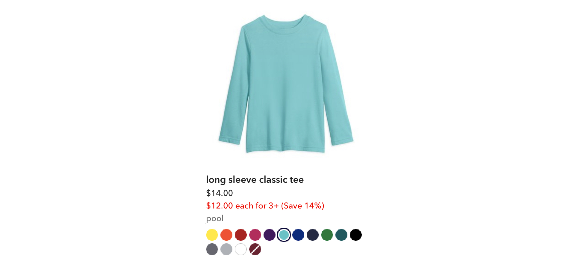
A product card on Primary that shows the color options for each item; at Primary, we call these swatches.
At Primary, color is an enormous part of our brand and the items that we sell. Our items come in a rainbow of colors and all kinds of prints, and we’re constantly adding new shades and patterns to our collection with our seasonal launches. When I joined the team, adding new colors and patterns as swatches on the site was an involved process that took 3 teams, countless hours, and had a lot of room for error.
In early 2020, we created tooling that revamped the entire process during a company hack week, then launched it for our Merchandising team. These tools gave our Merchandising team full control and almost entirely eliminated the need for design or engineering assistance.
The old swatch process
In January 2020, Primary had a palette of 40 different shades that came in over 200 solids and patterns, such as stripes, hearts, and dots. With each seasonal launch, we introduced new colors into the palette as well as fresh patterns. Our spring 2020 launch was going to introduce 14 new shades and about 250 new patterns, essentially doubling the number of color options on the site. For every color option that we offered, we needed to create a swatch to represent that option on our product cards and on the product detail page. It was a lot of swatches, and that number was only going to continue to grow.
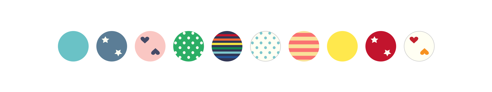
Examples of different swatches on Primary: solids, hearts, stripes, stars, dots.
The number of swatches wasn’t the only challenge. The creation of the swatches was a tedious process that involved three of our teams: Merchandising, Creative, and Tech. Here’s roughly how that process worked:
Our Merchandising team had tools for maintaining the list of available color options the items came in and added new color options to that list before a launch. Meanwhile, our Creative team defined the hex color for each new shade to make sure the product photos and the swatches matched perfectly on the website. Then, a designer (me) would take the list of all the new swatches needed from Merch, the list of the new hex colors from Creative, and individually draw each new swatch in Sketch. Once the swatches were drawn, I saved each out as an SVG and uploaded them to S3. Finally, an engineer would add the new clothing hex colors to a variables Sass file, then update a very large mixin to define the CSS for all of the new swatches. Solid colors were drawn as a circle using CSS, while patterns were built using SVGs as the background images, using the filename from S3. Each swatch had its own class name using a convention based on the name of the color and the pattern.
However, as one would expect, there was often a lot of tweaking before the new colors went live. Whenever a change needed to happen to the swatches, it required triangulating between all of the involved teams. If Merch changed the name of a color, we needed to update the class name in the CSS since it was based on the name of the color. If a hex color needed to be tweaked, we had to update it in the variables file as well as on every SVG that used that color. And if there was a typo anywhere, everything broke.
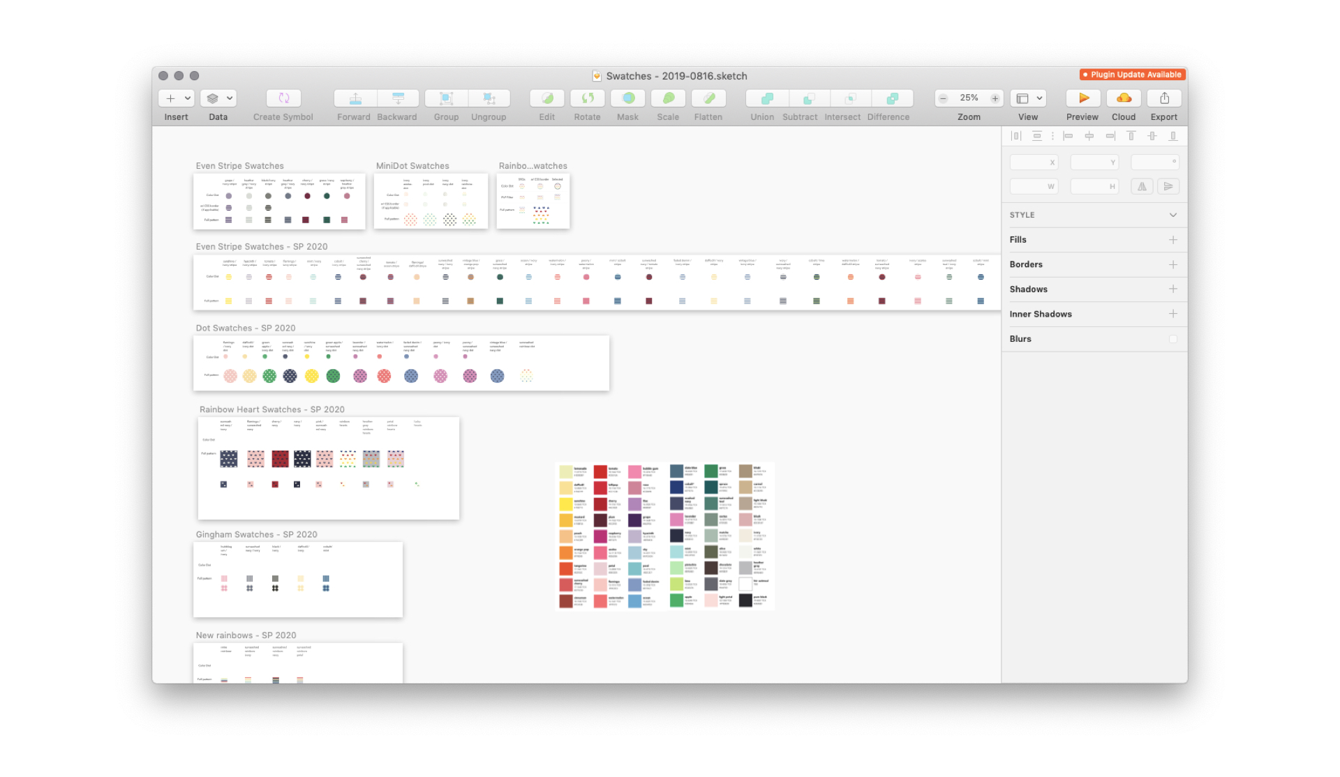
The Sketch file I used to create new swatches for spring 2020.
On the design side, there was a lot of copying and pasting to create swatches. It was mindless work, which was fun to crank through while listening to music, but it took an extraordinary amount of time. The only situation in which design skills were really needed was when there was a new pattern to draw. Otherwise, for the most part, this work was just copying a swatch, pasting it, swapping out the colors, saving it out, then uploading to S3.
Speaking of S3, things got hairy if we decided to change the appearance of a swatch. If I got the colors wrong (which I accidentally did a few times), if the pattern didn’t scale nicely, or if we decided to redraw it, it took a lot of effort to update on the site. We either had to bust the cache (which only an engineer could do), or we had to change the S3 filenames in the CSS to reference the new images and deploy the update.
After going through my first big swatch update in January 2020, it was clear that this process was much more tedious than it needed to be and depended too heavily on the Tech team. Technology is great at solving tedious or repetitive tasks. Surely there was a better way to create new swatches for the website.
Developing a proof of concept
After spending a few dozen hours looking at SVGs in Sketch and in code for the spring 2020 clothing launch, it occurred to me that the SVG code for each swatch was practically the same depending on the pattern. The only difference between each stripe or each star swatch was the hex codes, but those were also known quantities that pulled from a set color palette. Stripes had two colors: a foreground and a background color. Same with stars and dots. Solids were just a circle. We could build templates for each pattern using SVGs, then pass in the necessary colors to create each color option. It might actually be more efficient to build these in code than to save each out through a design tool and upload unique versions.
See the Pen swatches as SVGs proof of concept by Jessica Harllee (@harllee) on CodePen.
The proof of concept I put together to understand how hard it was to build swatches in code.
To see if this was worth exploring, I spent a few hours putting together a proof of concept in CodePen. I created a few utility classes for fill colors, then built variations on a solid, a stripe, a star, and a dot pattern by only changing out the color classes. By using SVG groups for every shape that was the same color, I could reduce the number of spots that needed updating between each swatch. While pretty rough, you can see how easily we could create infinite color combinations of swatches. The only time we’d need Sketch was to create a template for new patterns.
I shared the proof of concept with our engineering team, and not only did it seem doable, but it was serendipitously timed. Our company hack week was coming up, and the theme was tooling that would make admin lives easier. I paired up with an engineer with whom I had been working on improvements to color filters, and she and I began plotting out how to make this happen.
Creating admin tooling
In addition to being easier to implement, this method of creating swatches also lent itself nicely to a build-your-own-swatch tool. By reducing swatches down to a choice of pattern and colors, we could create a simple, visual interface for our Merchandising team to create and manage swatches for each color option.
At the beginning of hack week, the engineer and I sketched out all of the necessary components of a swatch builder tool and outlined different states. We were already in the middle of a big update to the color management tools for admin, so we decided to work the swatch tool into the new color management UI. While she started on the swatch builder functionality, I did some quick wireframes.
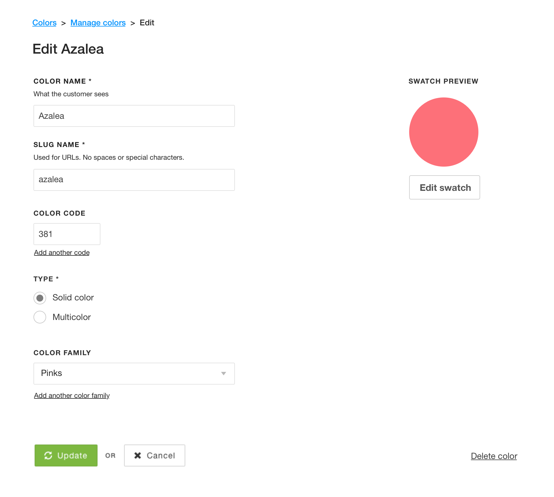
A wireframe of the new color detail page, with a spot for editing the color's swatch.
Each color in the color management tool had its own detail page for editing things like the name of the color and the color family it belonged to, so this seemed like a natural place to add the UI for editing the swatch. I added a space for a preview of what the swatch looked like and a button to create and edit the swatch in an overlay.
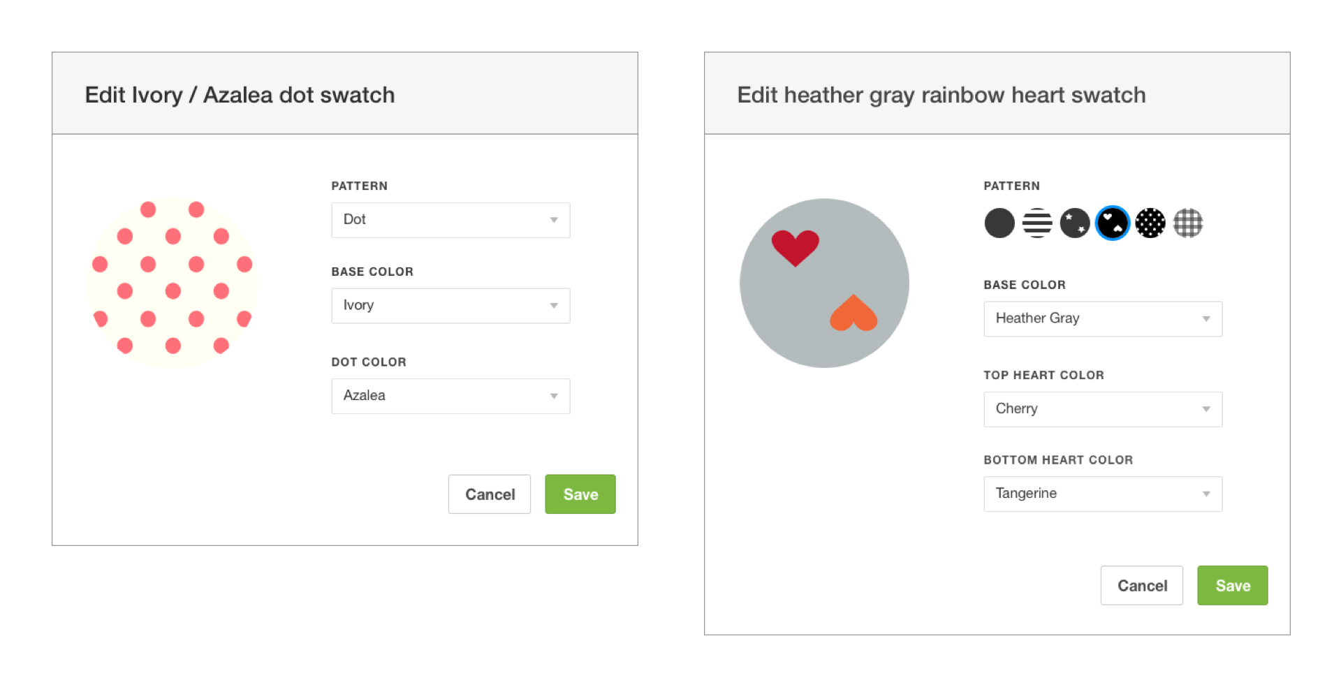
Wireframes of the swatch builder overlay, in which Merch could choose the pattern and the colors for each swatch.
In the overlay, the Merch team would have to choose two things: the pattern and the colors. The colors could be chosen from a dropdown with a list of our color names. The more colors in a pattern, the more dropdowns we’d show. The pattern could also be chosen from a dropdown, but it would be nice if we could use the swatch patterns as a visual reference when selecting the pattern (while a cool idea, this was later scrapped in favor of using existing UI patterns to get the feature out quickly). Colors without a swatch defined got a very obvious empty state.

Examples of the new swatch SVG templates, one for each pattern.
Once I had wireframed everything out, I then turned my attention to creating all of the different SVG templates that we were going to need. I opened up the mega Sketch file with every single swatch, grabbed one of each pattern, and began the process of turning them into templates. I made sure each pattern was drawn consistently and in greyscale, then combined shapes within the patterns so each color only had to be applied in one spot. I then exported as SVGs, ran them through an optimizer, and shared them with the engineer, who was ready to wire them up in the swatch builder.
The last piece of the puzzle was creating a tool to house the master list of hex colors for every color we offered. This had previously been maintained in our Sass variables file, but since our goal was minimizing the need for engineering involvement in swatches, the Creative team would need a tool to manage each of the values. This list would be what the swatch builder would reference when applying colors to the swatches.
The final swatch builder in the admin UI, creating a new swatch in a fraction of the time it used to take.
By the end of hack week, we had a functional swatch builder that could create and save swatches in the color management tool. It was super exciting. It still wasn’t quite ready to be launched, though, so we got more engineering support and folded the remaining work into the launch for the new color filters. Engineering shored up the admin tooling, then did the work to replace the old swatches with the new SVG swatches across primary.com.
Launch and reception
A few weeks after hack week, we turned on the tools for admin and walked the Creative and Merch teams through how the new tools worked. We then slowly ramped the customer-facing UI to gain confidence and catch bugs.
Right after we launched the new swatch tools, the Creative team did a sweep of colors across the site to find mismatches between swatches and product photos. They were able to instantly update dozens of swatch colors to be more accurate on their own without depending on the tech team at all.
When the summer 2020 launch came around, Merch was able to build all of their own swatches for new products. Tech was only needed to create a few new swatch pattern templates.
These tools enabled Merch and Creative to have more control, decreased the number of people and teams needed to be involved in swatch updates, and dramatically simplified a process essential to our product launches.
Project details
Role
Design, front-end prototyping
Core team
2 engineers
Released
February 2020